Wednesday 1 May 2013

Brainstorming


Exploring the brief- Covert & Obscured


Narrowing it down to 3 ideas & exploring form


Tuesday 30 April 2013

Initial research (1)

Exploring my chosen subject matter

Masks

Masks are a form of disguise. It is an object that is frequently worn over or in front of the face to hide the identity of a person and by its own features to establish another being. This essential characteristic of hiding and revealing personalities or moods is common to all masks. As cultural objects they have been used throughout the world in all periods since the Stone Age and have been as varied in appearance as in their use and symbolism.

Masks have been designed in innumerable varieties, from the simplest of crude “false faces” held by a handle to complete head coverings with ingenious movable parts and hidden faces. They can be made from substances such as wood, metal, shells, fibers, ivory, clay, horn, stone, feathers, leather, furs, paper, cloth, and corn husks. Surface treatments have ranged from rugged simplicity to intricate carving and from polished woods and mosaics to gaudy adornments.

 Many masks are primarily associated with ceremonies that have religious and social significance or are concerned with funerary customs, fertility rites, or curing sickness. Other masks are used on festive occasions or to portray characters in a dramatic performance and in re-enactments of mythological events. Masks are also used for warfare and as protective devices in certain sports, as well as frequently being employed as architectural ornament.


Maquerade ball specific - films


Similar images to masks


Monday 29 April 2013

Initial research (2)

Screenshots of Pinterest boards

Subject matter- Masks


Similar aretefacts


Inspiration


Friday 1 March 2013

Thursday 7 February 2013

Case Study: Flaunt Magazine

picasion.com


Context

FLAUNT magazine is an ongoing metamorphosis of new ideas and territories. Under the direction of its founding editors, what began as a luxury fashion title has progressed into a full-fledged lifestyle publication interested in both the serious and fanciful examinations of issues relevant to the realms of fashion, art, film, music, media, and literature.
The title FLAUNT could be interpreted in multiple ways but I think that it’s just trying to say it’s an ‘extrovert/out to impress’ publication. It’s short, striking and unique.
Like most magazines today it is being produced for a profit and one of the main aims is to sell to consumers, however it is less commercialised than magazines such as “MORE” or “LOOK”. The individual issues give it a more treasurable feel so it can be kept and appreciated in a artistic sense.

It's production began in 1998 and up to this day the covers have been consistent in there 'quirky' and individual appearance. Instead of reflecting the high-tech society we live in today, the abstract and hand drawn nature actually reflect a more dated style of cultural magazine. When compared to other more mainstream magazines, such as Vogue or Elle, it appears less high-end fashion, despite the contents still being high-end.

Form

In this particular issue the colour scheme is black and white with the additional use of other colours such as blues, reds and oranges. Black, being the most dominant, contrasts effectively with the white making it appear more vibrant, thus standing off the page more. The excess of black used also gives the image a slight gothic ‘mis-en-scene’ which is very alluring and mysterious. Textures have also been utilised but not on the page as as whole, instead just the cover image contains a grainier texture on the face (aimed to make the image seem more hand-drawn and more realistic in terms of skin texture).
As for space usage, magazines tend to be very structured and this one is no exception. The overall composition is very controlled: the cover image is almost symmetrical, filling the page, with the centre line running straight through the eye. All of the text in central aligned  and justified to give equal gutters around the page border.
For a magazine cover this is quite sparse. Unlike the likes of “MORE” and “COSMOPOLITAN” on this publication the only cover text used is the header, feature article and institutional information.The rest of the cover page is filled with the cover image, and white space (which in this case is the black of the hair). By not crowding the front page with text and pull quotes the finished piece looks very sophisticated and the readers are forced to physically open the magazine (drawing them in) to find out what is contained inside.   
The sophistication is carried over in the serif typeface header which gives a very neat and polished finish. Even though the cover image initially looked hand-drawn with the varying tone and texture, there is little evidence of ‘the hand that made it’, suggesting that it has been touched up in photoshop. The colour doesn't leak over any lines and it all very precise.

Process

For this cover the main means of production would have been made with a combination of traditional and digital media. Notably photoshop would have been used for image manipulation. An original mock up of the desired image is likely to have been hand-made. For the cover image a pencil sketch would have been created via observational drawing from photographic resources, then inked in afterwards using sable watercolour brush. The watercolour aspects will have been enhanced and altered in photoshop during post production. Skills needed for producing this cover include computer knowledge, artistic talent/skills including drawing and painting and also general artistic integrity.
 For the main title typeface a designer was probably paid to create the font especially for the magazine. However, it does have similarities to the Didot font. The font used for the coverline, "Leighton Meester" would have been written in black using a brush and then inverted in Photoshop. It would have taken many attempts to write out though, to get it to the desired style and standard.

Personal response

The thing that first caught my attention was the hand-drawn element of the cover image. It’s more unusual as a large majority of fashion/art/culture/entertainment magazines today use photoshoot images. I also like the addition of the watercolour-style shapes as they add more depth and layers the to finished piece. The ‘FLAUNT’ magazines on the whole remind me of a ‘THE WHITE LIES’ magazine as they too contain hand-drawn elements which ,to me, makes the magazine feel more like a piece of art that I could keep and look over again and again, not just some commercialised publication that is the same every time and so ends up getting binned.


Flaunt Double Page Spreads

here


Form


A key feature within ‘FLAUNT’ double-page spreads is that the images always bleed right to the edges of the pages. Quite often the photograph on one page protrudes onto the page opposite (as above). As the photographs take up 2/3s of the page on a hierarchy basis we see this first then our eyes move to the body text. The monochrome palette of this spread emphasises the utilised white space making the photos and text juxtapoz further.

Despite the images ‘invading’ the page the whole composition is very structured. A base-line grid will have been used to ensure the text is aligned and has continuous equal gutters throughout the magazine. Unlike a lot of magazines these days, the body text is justified as opposed to flushed left. This adds a simplistic yet stricter feel to the article, in my opinion giving it a more ‘important’ ambience. “You should read this article as it says intelligent things”. Unusually you can also see a lot of rivers within the text, normally we strive to remove these, but by leaving them in it adds some variation to the page, breaking up the structure a little. This little outburst parraels with the photographs. They all use the same model, theme and color scheme, but there is one that is out of focus (adding some diversity and intrigue). This one particular photo also happens to be the only one in which there isn’t direct eye contact.


Process


The main processes for this double page spread would be photography and photoshop. The initial shots would have been done in a studio with studio lighting focussed on the head. A black backdrop has been used, and the light would have been moved to shine from different angles in various shots, creating different shadows on the models face. The photographs would then be collated and edited in photoshop. They will have been resized and cropped. and then the final ones to be used in the spread would be selected. The levels of contrast would have also been altered to make the black seem stronger and to make the white appear more prominent in the picture.  

For the article the body text was most likely written out first and then inserted onto the page once the photographs had been placed. It has also been manipulated so that rivers have been created in the text block. Finally, the first letter of the article (in this case, the letter I) has been capitalized and enlarged to draw you into the article.


Personal Response

The thing that first caught my attention with FLAUNT’s double page spreads was the effective use of whitespace and dramatic, dynamic body text. Everything is very straight-edged but somehow is edgy and different, as opposed to being boring. The photos on this spread in particular are very captivating, there’s no headline and splash to tell you what the page is about, yet the direct eye contact is almost invasive and draws you in. The whole page is has a ‘raw’ feel that is emotive and poignant, very different to some of the catalogue-style photoshoots where everyone is colourful and happy. The only thing I think there could be is a subtitle or something, just to break up the large intimidating paragraph.


Wednesday 23 January 2013

Case Study: Alexandra Valenti


Context


Alexandra Valenti is a mixed media artist who blends patterns made in watercolors with photography from Austin, Texas. Her art has been described as a "dreamy, sun-drenched flashback that jolts you from your current moment in time and into a psychedelic world all its own". She has designed for magazine spreads, CD covers and even advertisements. Even though a lot of her work is for profit she initially started creating pieces through her mere passion for the art. These pieces were all created in the 2012, and in some ways they do reflect this. The clothing of the model's is all very in-keeping with with the ,now-popular, vintage style. This adds another layer to the appeal of Valenti's work as the mis-en scene created fits in with the current trends of today.

Form

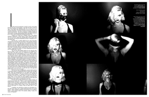
The colour palette for Valenti’s work is achromatically based. However, on the particular set that I've been looking at there’s an insert of bright,eye-catching colour which juxtaposes with the monochrome background. The tone of the actual photograph varies quite a lot due to the different light sources and exposure, but this is manipulated to add another layer to the finished print. While the splash of colour initially looks bright, the colours on the photograph above actually have quite a low saturation.
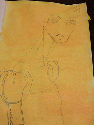
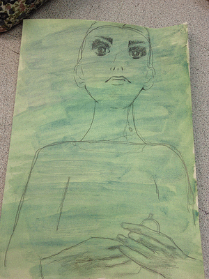
This image is a combination of hand-drawn and digital art, and the addition of the painted circle gives the picture a more abstract feel. The hand-drawn element reduces the rigid structure of the photograph, and there is evidence of the ‘hand that made it’ in the color work itself. You can see the brushstrokes in some parts of the colour which adds more detail to the finished piece.
Also, the overall finish of the prints seems to have a very light grain over them to make them appear more vintage and aged.

The whole ambiance and mis-en-scene created within the image is quite rustic. The recurring nature theme gives an earthy feel, the one above even includes water which only emphasises this further. The choice of clothing and hair/makeup within photography is also crucial. In this photograph the girls hair is loose and seems very natural (it’s not been perfectly styled, just left to it’s own devices) intensifying the initial feeling of freedom. The fact that the model looks to be naked in this picture also highlights this. The lack of identity here could suggest that it could be anyone stood by the river, even you. Unlike a lot of staged, set, photography the audience feels less alienated in this kind of situation because it’s a lot more relaxed; the absence of perfect lighting and a flawless face/figure/hair is far less intimidating.  

Processes


Interviewer: What’s inside your camera bag?
Valenti: A Leica, a Nikon,  a point and shoot… lots of batteries
Interviewer: Your photo’s have a signature feel.  Does the vintage look come from using film or Photoshop?
Valenti:  Both. I treat my photographs whether it’s film or digital.  It’s part of the fun for me.


For this image Valenti would have taken the initial photograph, most likely in standard colour settings as opposed to sepia. She wouldn't have needed to set up any lighting because of the outdoor setting, however she will have had to have taken the suns positioning into account as this would change the tones within the image. Once she had the photograph it was probably altered in photoshop to create the sepia palette and some noise or texture was probably added to emphasis the vintage style.

The colour circle will have been first drawn out in pencil then watercolor. The detailed part in the center will have been either done using some sort of fine liner or black ink.  The circle will then have been photoshopped onto the photograph and the colour may have been adjusted slightly. Valenti would have had to cut around the figure of the girl in this case to successfully put the circle in the background and bring the model to the foreground.

Personal response

The first thing that drew my attention about Alexandra Valenti’s photography was the sporadic use of colour she uses on such a sepia, vintage style photography. Her main subject matter of nature, summer and water makes her photographs feel almost dreamlike. It reminds me of festivals and summer holidays which evokes pleasant and adventurous feelings. I find the ‘freedom’ element really inspiring and just the model having her arms raised in such a fashion gives a sense of possibility and opportunity. I also like how the photographs are actually quite simple and not in staged rooms and so in some ways ‘false’. The addition of the watercolour adds an intriguing layer to the image without trying to be over-zealous or extravagant.


Wednesday 26 December 2012

Subject Matter


Above are photographs I took at the V & A Museum, The Tate Modern, Camden and tube stations (included are photographs of magazine covers I found and just general inspiration).

Saturday 13 October 2012

Copies and emulations

For my first artist I decided to copy and emulate Ekaterina Koroleva

Here is some of her work: 

For the copy I used inks, pencil (HB & 4B), graphite pencil, acrylic paint, scalpel

Work in progress shots:

create an animated gif
I had to stand on a stool to make the ink splashes. By having them fall from a bigger height the splashes were far more effective

Cutting out the pattern for the top using a scalpel

Original
My copy


I then made an emulation of Koroleva's work: 

create an animated gif

I used the same materials and tried to copy her drawing style. To make it my own instead of doing ink splashes I let the ink run down the page.

Untitled

I also copied a something in the same form as mine: an Interview magazine cover

Series of interview magazines:


David Bowie for Herb Ritts.
Original cover


I tried to recreate the above cover image using lighting, a lace doily (to create the shadow) and then altered the saturation and levels in Photoshop. I also made the eye whiter to make it more similar to the original. 

Holding the doily in front of the light to create a shadow
Original photograph
create an animated gif

Finished copy


Emulation of the interview cover:


Original photograph


Black lace pattern I wrapped the image with
How I did it:

I took a photograph I took of my friend and some lace and wrapped the lace pattern around the face in photoshop. I did this by first de-saturating thephotograph and altering the levels of contrast to elimate some of the grey tones. Next, I applied a Gaussian blur and created a displacement map. Once I'd done this I just experimented with the blending modes until I found one I liked best. I settled for Linear Dodge (Add), and then once again I altered the levels to bring out the lace pattern better.

Work in progress: 

free gif creators

Finished emulation: 


Friday 14 September 2012

Further drafting


Pencil
Ink
Ink fill
Blue and red watercolour


Final drafts


Double page spread